The New York Times recently made a map of every building in the US. I decided to see how round they were:
 And here is a higher quality pdf.
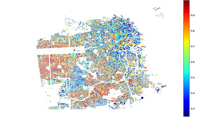
To define a building’s ’roundness’, I calculated the asphericity, which is equal to 0 for a perfectly spherically or circularly symmetric set of points, and is equal to 1 for a line. Very round buildings are blue (see Candlestick, RIP, in the lower right) and very thin buildings are red (see all of the Sunset).
The building outlines were inferred from satellite imagery, so buildings that are touching are often combined into a single polygon. It might be more correct to say that this map actually shows how close buildings are to each other. But in the case of San Francisco, the overall trend from the satellite images isn’t actually that different from the reality, it’s just rotated 90 degrees.
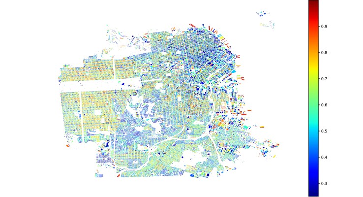
San Francisco has a map of every building polygon, so I repeated the calculation for the real city. It turns out that the buildings in the Sunset are still skinny, but skinny in the direction perpendicular to the street, not parallel to it.
Stay tuned for other cities!

You must be logged in to post a comment.